If It Were Not for the Data, Everything Would Be Great
October 02, 2020
Share this story on:
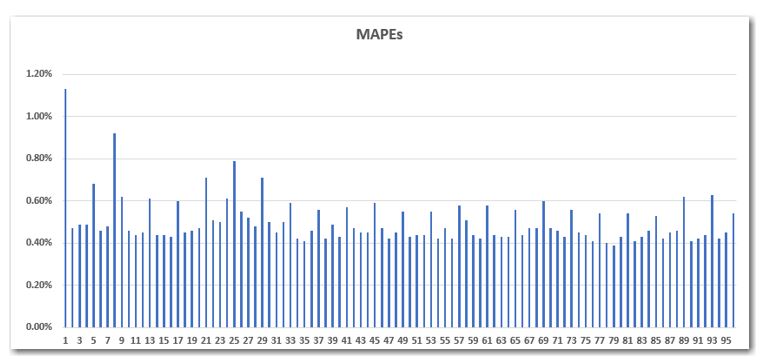
I recently developed a set of 15-minute load forecast models when I noticed something odd in the pattern of the MAPEs (Mean Absolute Percent Errors) from interval to interval. After unsuccessfully trying a few of my usual tactics to resolve the problem, I presented the following figure to one of my colleagues:
Not wanting to let the proverbial cat out of the bag myself, I said, “Do you see what I see?” After a moment of reflection, he indeed saw what I saw: the MAPE of every fourth interval jumps up. That is not cool at all.
Here is a bit of background. This set of models is highly auto-regressive. That is, each model uses lagged loads from the prior four intervals as driver variables (as well as the typical calendar and weather variables). The model for 1 a.m., for instance, depends upon loads from 12:45 a.m., 12:30 a.m., 12:15 a.m. and midnight. This is a common approach for very short-term forecasting. Not to put too fine a point on it, but I have used this same approach many times without incident.
In an effort to identify and to ameliorate the problem, I tried a few things. I had thought that the weather data might not be aligned correctly with the load data. I removed all of the coincident weather variables and re-worked the models so they all have the same specification (except for the relevant lagged-loads) with the same time-of-day weather variables. When that failed to resolve the problem, I was sufficiently convinced that the weather was not the issue. I also tried manipulating the lagged intervals, excluding the fourth lag (i.e., the 1-hour back) variable and other similar inclusions and exclusions of various lags. That too proved to be like an empty apple bag – entirely fruitless.
This is not the data for an individual customer or even a small municipality. In fact, the data is for a transmission grid, accounting for the electricity consumption of millions of customers. After some deeper contemplation, consultation and reflection, we decided that this is not the way real load data behaves! There is no reason that models at the top of the hour should be systematically worse than models from the :45- minute mark or the :15- minute mark. This data was clearly not measured, but rather, it was constructed. Further, it was constructed in such a way as to create a bias in the resulting values. This is not obvious when observing the load data itself or even when viewing the ramp-rates (i.e. the interval-to-interval deltas).
We dug deep into our mental archives for a solution, where we found our old friends Savitzky and Golay. (Let me tell you: those guys knew how to rock!) I will leave it to you to review their work. Essentially, their idea is to apply a smoothing algorithm to the data. In this case, we applied a 5-period centered polynomial weighted average. Our goal is to identify the ‘signal’ in the data and not to be distracted by the “noise.”
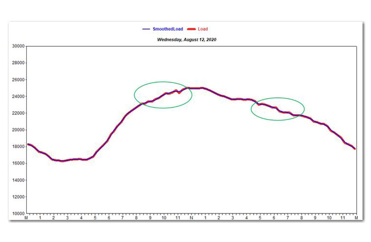
The following figure displays one day of 15-minute data that is both smoothed (in blue) and raw (in red). A few observations are circled to illustrate that the smoothed data cuts through the center of the noise in the raw data, thereby creating a less volatile series.
The 5-period centered smoothing algorithm is generalized as:
Where:
i = interval. In this case, there are 96 intervals per day because the data has a 15-minute frequency.
-3, 12, and 17 are the “convolution coefficients” as derived by Savitsky and Golay.
The following is an example for the 12 p.m. interval:
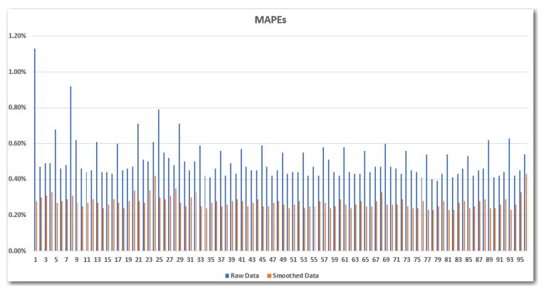
I will spare you the details of the mechanical processes we used in MetrixND and MetrixIDR to perform these calculations and I will cut directly to the climactic fight scene. We ran the identical models, but this time the data had first been smoothed. The following figure presents the MAPEs from the original models in blue and the new models with smoothed data in orange. There are two salient points:
The dramatically higher MAPEs at the top of the hour are largely eliminated by smoothing the data.
The models with the smoothed data are systematically better than the original models, as evidenced by the orange bars being lower than the blue bars for the same intervals. In fact, the average MAPE for the 96 intervals was reduced from 0.50% to 0.27%. Cutting the average MAPE in half is no small feat.
Many of the changes we make in models tend to have marginal impacts. Further, the changes often have the effect of improving some intervals while degrading other intervals. I rarely see changes in models that are both dramatic and systematic. When those two criteria are met, I declare victory.
What can we learn from this? First, we can use the models themselves to inform us about the data. Remember, it was the pattern in the MAPEs that led us down this road. Second, we cannot necessarily trust the data itself. The numbers are not provided by a ‘data fairy’ who magically and lovingly delivers pristine data to us under our pillows while we sleep. In most cases, we do not know the story behind the collection or calculation of the data. We must be vigilant and skeptical. Further, we can use the tools at our disposal to address many of the issues that we face.
Since joining Itron in 2000, Mr. Simons has developed, implemented and supported numerous day-ahead and real-time forecasting systems for Independent System Operators (ISOs), retailers, distribution companies, cooperatives and wholesale generators, including NYISO, IESO, TVA, Consolidated Edison, NRG Energy, PSEG and Vectren. Mr. Simons has implemented systems to support budget & long-term forecasting, weather-normalization, and unbilled-energy estimation for municipal utilities, electric cooperatives and investor-owned utilities, including Ameren, Entergy and FirstEnergy. Mr. Simons has developed forecasting and analysis solutions for municipal water utilities and has developed several customized applications and models for forecasting revenues, managing bills, weather-normalizing sales and estimating unbilled energy. Mr. Simons has reconfigured, streamlined and deployed load research systems at multiple utilities including United Illuminating, Indianapolis Power & Light, TECO Energy, NVEnergy, Colorado Springs Utilities and Lincoln Electric. Mr. Simons has implemented real-time natural gas forecasting systems to support operations at Vectren Energy and Consolidated Edison. In 2019 and 2020, Mr. Simons was a key team-member on a well-publicized report for NYISO to analyze long-term weather trends across the New York state.